

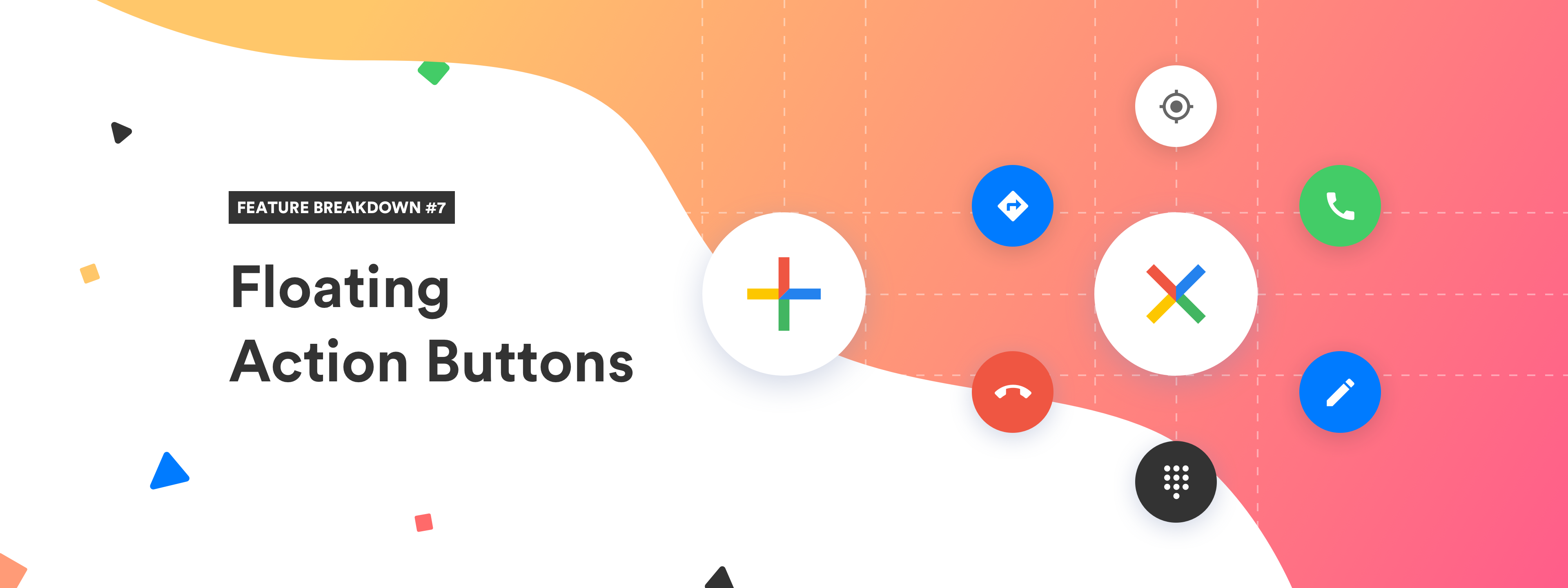
In recent years, many modern websites started adopting floating action buttons. And there is a good reason behind this adoption. After all, the floating action button is very popular in Material Design.
Personally, I love using them! And if you'll continue to read this article, you'll see how I'm using it on this site.
By reading this article, you'll learn what is the floating action button, when to use it. And lastly, you'll learn how to implement a floating action button in React.
info
Floating action button (FAB) that we're gonna implement together will look like this. And it will only use React and pure CSS.
Before we dive straight into the implementation, let's examine what the floating action button really is.
What Is Floating Action Button
As the name of this element suggests, the floating action button encourages users to take an action. It is a common component that is used on the modern websites. This button can be used in various ways, such as adding items to a shopping cart or signing up for an account.
In the past, a floating action button was mainly used in mobile interfaces. However, due to its increasing popularity and efficiency, websites started using this pattern as well.
The button usually appears on the bottom right corner of the screen and can be tapped to perform a certain function. This is a navigation pattern that has been popularized by Google’s Material Design. Since, it has been adopted by many other designers.
Floating action buttons are a new way of interacting with websites. They are used to quickly access the most important features of a website. And on top of that, they are creating a sense of urgency for the user.
tip
If you want to navigate the user to a most important part of your website, you should consider using floating action button.
The most common design of floating action button is demonstrated on the picture below.

Original Image
When to Use Floating Action Button
Now that we understand what the floating action button is, let's answer the next question - when should you use it?
You should use a floating action button when you want your users to take a specific action. This action will help them complete their goal on your website.
info
If you're building an e-commerce site you can use a floating action button for adding items to cart and checking out. If you're building a recipe app, you can use it to add a new recipe into collection. I think you get the idea.
With all this information in mind, we can proceed to the most fun part of this article. We're gonna implement a floating action button in React.
FAB Implementation in React
In this section, we'll take a look at the implementation of FAB component in React. The floating action button will look exactly like on the demonstration below.
info
Full source code is available on Github.
Floating Action Button Structure
In order to get to the state that's displayed on the video, we'll need to work our CSS magic. But first, let's focus on the basic functionality of the component.
We need to display the floating action button all the time. Additionally, we need to show action buttons in hovered state.
In order to do this, we need to keep track of open state. This piece of state will tell us if the user is hovering the FAB, or not.
Basic structure of FAB
import { useState } from "react";
import cn from "classnames";
import { MdAdd } from "react-icons/md";

import "./styles.scss";

const FAB = ({ actions }) => {
  const [open, setOpen] = useState(false);

  // Set open state to true if user hover over "ul" element
  const mouseEnter = () => setOpen(true);

  // Set open state to false if user hover out of "ul" element
  const mouseLeave = () => setOpen(false);

  return (
    <ul
      className="fab-container"
      onMouseEnter={mouseEnter}
      onMouseLeave={mouseLeave}
    >
      <li className="fab-button">
        <MdAdd />
      </li>
      {actions.map((action, index) => (
        <li
          style={{ transitionDelay: `${index * 25}ms` }}
          className={cn("fab-action", { open })}
          key={action.label}
          onClick={action.onClick}
        >
          {action.icon}
          <span className="tooltip">{action.label}</span>
        </li>
      ))}
    </ul>
  );
};

export default FAB;
Believe it or not, this is the final implementation of the component showcased in the video. We can use this component in our app like this.
Usage of FAB
import { FcAbout, FcBusinessman, FcCamera, FcFullTrash } from "react-icons/fc";

import Fab from "./components/FAB";

const actions = [
  { label: "About", icon: <FcAbout />, onClick: console.log },
  { label: "Profile", icon: <FcBusinessman />, onClick: console.log },
  { label: "Picture", icon: <FcCamera />, onClick: console.log },
  { label: "Trash", icon: <FcFullTrash />, onClick: console.log },
];

const App = () => {
  return (
    <main>
      <Fab actions={actions} />
    </main>
  );
};

export default App;
As you can see, the React part of this component is nothing complicated. CSS part, on the other hand, that's where it gets tricky.
After all, we need to handle a lot of transitions. On top of that, we also need to make sure that everything works smoothly. With that being said, let's dive in to the CSS part of this component.
Floating Action Button Styling
Since the component is very interactive, we need to handle a lot of logic, and transitions inside the CSS.
Styling the container and items
.fab-container {
  display: flex;
  // Display actions from bottom to top
  flex-direction: column-reverse;
  list-style: none;
  margin: 0;
  padding: 0;

  // Display button to the bottom right
  position: fixed;
  right: 2em;
  bottom: 2em;

  // Set max height to only trigger mouse enter
  // when user hover over first button
  max-height: 52px;

  &.open {
    // If open, container should fill the whole height
    max-height: max-content;
  }

  li {
    border-radius: 50%;
    box-shadow: 0 3px 6px lightgrey;
    display: grid;
    place-items: center;
    margin: 8px 0;
    font-size: 28px;
    padding: 12px;
    cursor: pointer;
    position: relative;
  }
}
tip
There is a lot of CSS stuff happening in the code snippet above. However, you should pay attention to the lines that are commented.
We're making use of flex-direction property to display the items from top to bottom. And we're also specifying max-height of the ul component to prevent hovering edge cases.
The next part is to style the original floating action button. This is just to set the colors properly.
Distinguish original button from actions
.fab-button {
  background-color: #00a8ff;

  svg {
    fill: white;
  }
}
The last part of the component that needs styling is a list of action buttons. We need to make sure they're displayed only when the FAB is hovered. And we also need to hide them if user hovers out.
.fab-action {
  // In React - We're rendering actions all the time
  // that is why we're hiding them
  // by setting scale and opacity to 0
  transform: translateY(50px) scale(0);
  opacity: 0;
  transition: transform 300ms, opacity 300ms;

  &.open {
    // When user hovers in, we display the actions
    transform: translateY(0) scale(1);
    opacity: 1;
  }

  &:hover {
    .tooltip {
      transform: translateX(-100%) scale(1);
      opacity: 1;
    }
  }

  .tooltip {
    padding: 4px 6px;
    font-size: 12px;
    position: absolute;
    left: -12px;
    transform: translateX(-75%);
    background-color: #353b48;
    border-radius: 4px;
    color: white;
    opacity: 0;
    transition: transform 300ms, opacity 300ms;
    user-select: none;
  }
}
And by putting everything together, we'll get the following stylesheet.
styles.scss
.fab-container {
  display: flex;
  list-style: none;
  margin: 0;
  padding: 0;
  flex-direction: column-reverse;
  position: fixed;
  right: 2em;
  bottom: 2em;
  max-height: 52px;

  &.open {
    max-height: max-content;
  }

  li {
    border-radius: 50%;
    box-shadow: 0 3px 6px lightgrey;
    display: grid;
    place-items: center;
    margin: 8px 0;
    font-size: 28px;
    padding: 12px;
    cursor: pointer;
    position: relative;
  }

  .fab-button {
    background-color: #00a8ff;

    svg {
      fill: white;
    }
  }

  .fab-action {
    transform: translateY(50px) scale(0);
    transition: transform 300ms, opacity 300ms;
    opacity: 0;

    &:hover {
      .tooltip {
        transform: translateX(-100%) scale(1);
        opacity: 1;
      }
    }

    &.open {
      transform: translateY(0) scale(1);
      opacity: 1;
    }

    .tooltip {
      padding: 4px 6px;
      font-size: 12px;
      position: absolute;
      left: -12px;
      transform: translateX(-75%);
      background-color: #353b48;
      border-radius: 4px;
      color: white;
      opacity: 0;
      transition: transform 300ms, opacity 300ms;
      user-select: none;
    }
  }
}
Putting all the bits and pieces together, we'll get the following result.
Concluding Thoughts
If you want to grab the attention of your users, and if you want to perform a certain action on your website. The floating action button is a way to go! After all, it has the action in its name.
In this article, you learned what the floating action button is, and when should you use it. On top of that, you learned how to implement your own floating action button in React.
With all of that being said, it's time for you to start thinking about adding a floating action button to your React project.